Kitchen backsplashes are one of the most unique areas in the home. They are one of the few surfaces that is often tiled, yet that serves no actual function. While once tile was installed in this area to protect the wall from stains and splatters, new cleansers and easy to clean paints have made the original purpose obsolete. Instead, the backsplash is now the place to express yourself in the kitchen design and is often one of the most decorative parts of the room.
Backsplashes can be made of any material, and they can come in any size, style, design, or pattern as well. With all the many beautiful products out there, it can sometimes be overwhelming when trying to find the right one. Thankfully, there are ways you can narrow it down to help choose the best backsplash for your kitchen.
Focus on Style
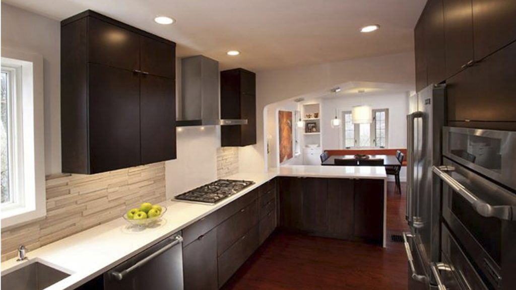
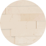
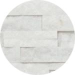
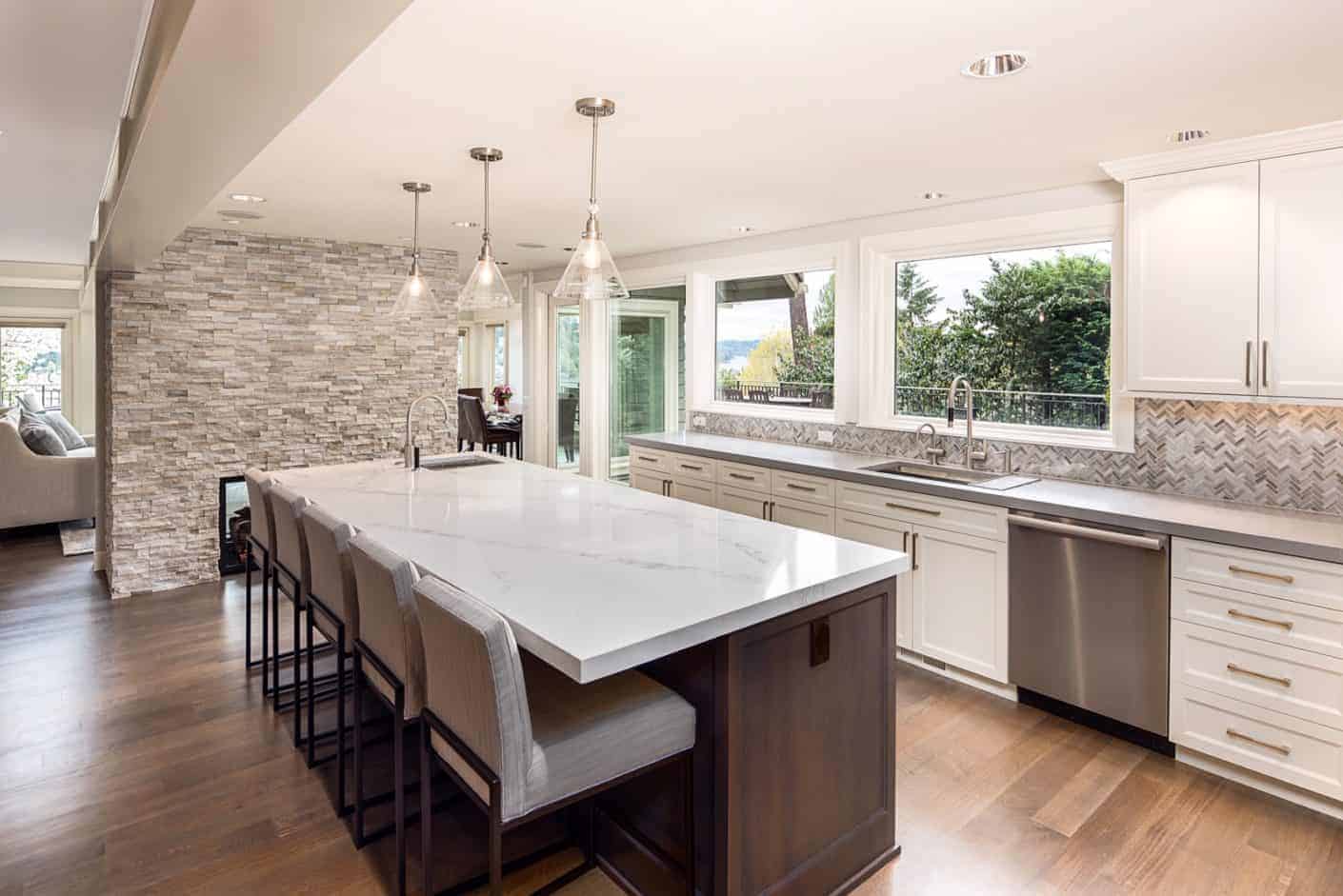
Because the backsplash is often added last to the rest of the room’s design, let the choices you’ve already made for the room be your guide in narrowing down the field. For example, the style of this kitchen is very sleek and modern with clean lines throughout the space. The backsplash needs to match those lines to help complete the space and give it a polished look. The honed stone veneer panels match the lines of the rest of the room, creating a cohesive design.
Don’t Stress Over Color
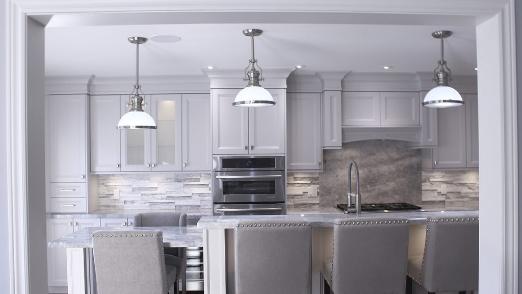
Color is another method you can use to determine the best backsplash for the space. Are you attempting to make the backsplash stand out, or are you looking for a more subtle design?
This backsplash helps create a monochromatic effect in the kitchen, which allows the texture of the material to be focus, rather than the color. This subtle style is perfectly in keeping with the rest of the kitchen’s features, bringing everything together with added dimension.
Go Bold with Contrasting Color
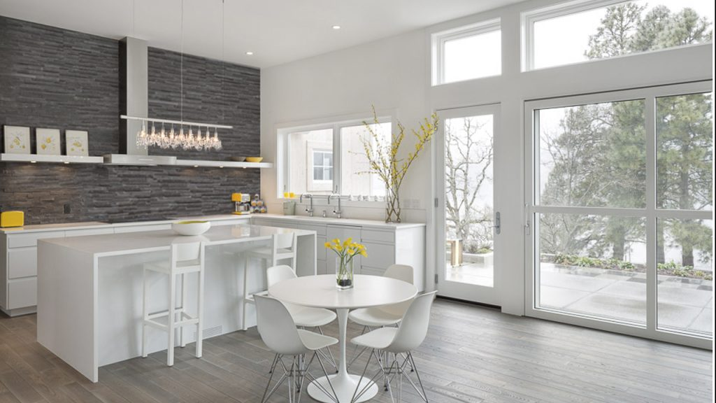
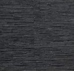
If you decide that the color of the backsplash needs to be the focus in the space, then consider choosing something that will contrast what else is going on. In this case, an otherwise all white kitchen gets a big boost in dramatic style with the addition of a charcoal stone backsplash.
When choosing color, the two rules of thumb are to either choose something that already exists in the room – no matter how small – or to go for the absolute opposite of what’s there to make the room
pop.
Contrasting Texture
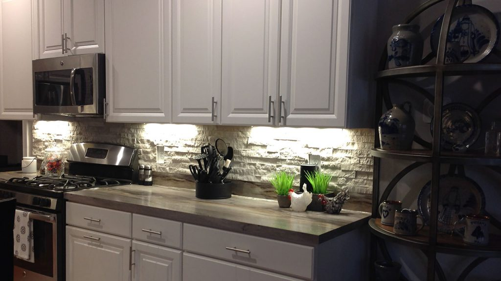
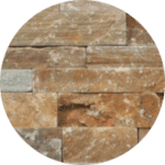
Your backsplash is butted right up against your countertop, so it needs to work directly with this other material as well. Just like with the colors in the space, you need to decide whether this relationship will be subtle or dramatic. In this case, the rustic stone is contrasted against the very sleek, honed countertop. Together, they create a much more dynamic display than a simple subway tile would. To keep the focus on the texture, the color matches up well with both the lighter veins in the counter and the cabinets above.
Mimicking Shape
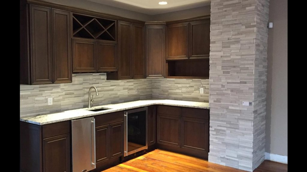
Another way to narrow down your backsplash options is to take a look at the shape of what’s already in the room. The shaker cabinets in this kitchen get a reinforcement in shape and design from the shape of the honed stone backsplash. The placed of the stone pieces in the design adds depth and shadow, which in turn creates focus in the room, elevating the overall design and turning an otherwise bland design into something striking.
How to Pair Counter and Backsplash Materials
The kitchen counter and backsplash sit perpendicularly to one another, meeting at the angle, which means that these two materials need to work well together in order to create a cohesive and harmonious design. This doesn’t mean that the two need to match one another or be made of the same material; coordination or contrast are equally beautiful options that can add even more depth and interest to your kitchen design.
Contrasting Styles
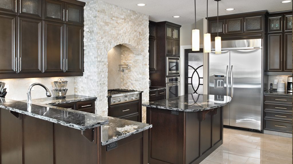
There are two rules of thumb for backsplashes depending on the type of impact you want to make on the kitchen design. Coordinating the colors of your counter and backsplash or matching the texture or finish of the counter and backsplash will give you a very subtle look. For a more dramatic appearance, however, you need to contrast the two materials in some way.
One way to add contrast is through color. For example, a very somber, white quartz countertop would pop against a bold red tile backsplash.
Another method to add contrast is through texture and style. A polished countertop with a high gloss finish will contrast beautifully with a natural stone backsplash that has a cleft-face finish. In either case, this contrast adds depth and interest that elevates the design.
Size Matters
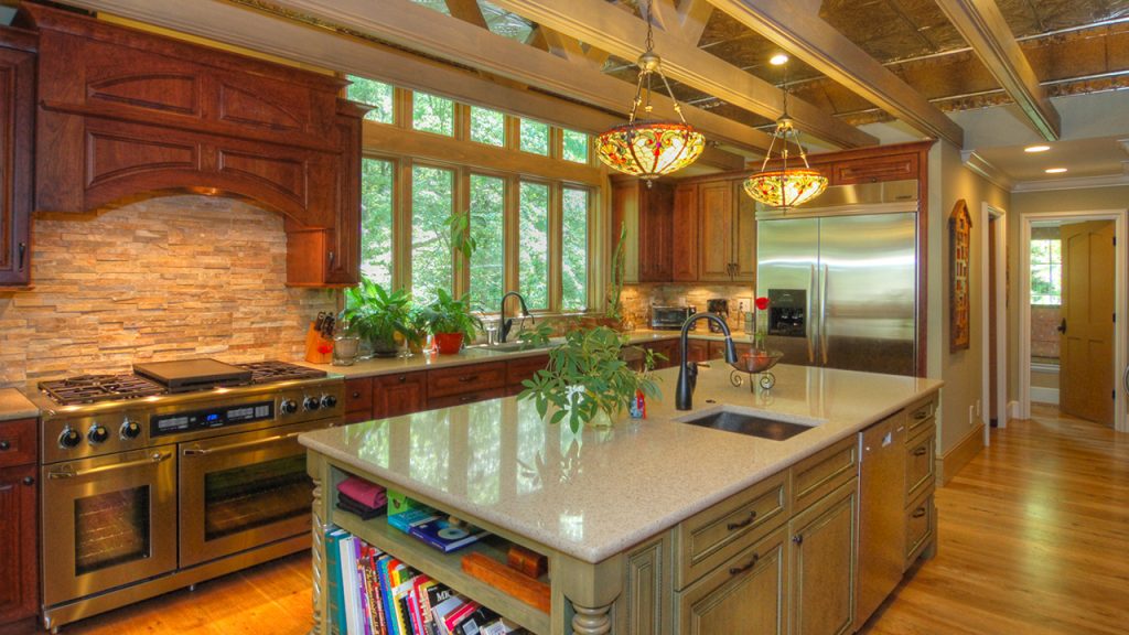
The majority of kitchen backsplashes are 18-inches high from the countertop to the underside of the upper cabinets. Some older kitchens may have backsplashes that are only 15-inches high as well. And even in homes that have the ability to create a focal point behind a cooktop, this area rarely measures more than 30- to 36-inches in height.
For this reason, the size of your backsplash tile matters a lot. Very large tiles can overwhelm a small space, and have the disadvantage of losing pattern. For example, while an 18-inch backsplash can handle four rows of 4-inch tiles with a 2-inch border, or six rows of a 3×6 running bond pattern, it can only handle 1-½ 12-inch tiles.
Likewise, a very busy pattern with a lot of decorative features in one small space can easily overwhelm the area. For this reason, most decorative designs need to be kept to accent walls or focal points to give them the space they need; keep the area along the countertops for more subtle patterns and moderately-sized tiles.
Get to Know Your Options
Your best backsplash can be any number of things depending on the look you want to achieve. Just find the area you want to focus your attention down to help narrow down your options to find the perfect backsplash for your kitchen.
